:max_bytes(150000):strip_icc():format(jpeg)/DesignandPhotobySaraLigorria-Tramp10-c2380a338dee41b382a1b13559ea7c88.jpg)
Less is often more when it comes to paint choices. If you’ve ever brought home too many paint samples and been left feeling really confused, we understand.
We love staying up to date on what paint colors are trending right now, so we reached out to a few designers to find out what colors are their favorites lately.
It’s exciting to see one particular color emerge as a popular choice, and we think it could be the new neutral.
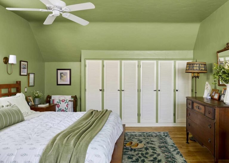
Winner: Shades of Pale Green
Design by Dan Mazzarini / Photos by Adam Kane Macchia
Green was the only color listed by all the designers we surveyed, and each version tended to be much more subdued than the jewel-toned greens we’ve seen taking center stage lately.
Want more design inspiration? Sign up for our free daily newsletter for the latest decorating ideas, design tips, and more!
Treron Green No. 292 by Farrow & Ball
Shailey Murphy is an interior designer based in southwest Missouri and her designs often feature multiple colors that are similar in tone and work together harmoniously.
Lately, Treron Green is one of her favorite colors.
“This is a true medium green,” says Murphy. “It’s not too light or too dark, and it’s definitely not a hunter green. It reads like a perfect neutral that can fit into almost any space.”
Mediterranean Olive by Benjamin Moore
This dark olive version features golden undertones, so it’s perfect for spaces where you want to add a little warmth. Dan Mazzarini is the creative director and principal of BHDM and ARCHIVE, and he often uses Mediterranean olive on both walls and woodwork.
“This color is bold and not for the faint of heart,” he notes. “But I find that deep, earthy tones make a room cozy and organic. It’s also a great backdrop for art.”
Lucienne Olive of Craig & Rose
Craig and Rose
This olive-sage combination is almost considered brown in some cases. Flora Hogg is an interior designer and color consultant at Craig & Rose, and she describes Lucienne Olive as a “soft peat green.”
This paint is part of the company’s 1829 Classic Collection, so it’s especially ideal for historic spaces and period-style designs.
“Its earthy notes create the perfect base for incorporating luxurious elements like brass hardware, ochre mohair curtains and teak,” says Hogg.
Tea Light by Benjamin Moore
Purvi Padia, interior designer and founder of REVELRY, cites a lighter, earthy green as one of her current favorites. Benjamin Moore’s Tea Light is a soft sage that brings tranquility to a room.
“It’s perfect for spaces where you want to evoke a sense of calm, like a bedroom or home library,” she says. “I’m drawn to its ability to act as a neutral and pair well with so many different color tones.”
Farrow & Ball Arsenic No. 214
Colordrunk Design
This green stands out a bit more than the other options on this list. Farrow & Ball’s Arsenic No. 214 is a mint green with a vibrant style. But in true Farrow & Ball fashion, it’s a bit muted, giving it a slightly rusty appearance.
Jenna Gross of Colordrunk Designs cites this paint as one of her most recent color obsessions, and she loves pairing it with greens, especially Frolic by Sherwin Williams.
Runner-up: Orange
There was one other color that came up frequently in our interviews, and it was a bit of a surprise. Three of the five designers we spoke to listed some version of orange as a color they can’t seem to stop using lately.
Farrow & Ball Red Earth No. 64
Shailey Murphy
This is the color scheme Murphy chose to use in her personal bathroom and she recently applied it in a client’s master bedroom on both the walls and ceiling.
“If you’re looking to take a creative risk, this is my favorite statement color right now,” says Murphy. “With a hint of terracotta and a touch of red, this color always makes a dreamy, high-impact statement.”
Farrow & Ball’s Faded Terracotta No. CC8
Padia describes Farrow & Ball’s faded terracotta as a color that delivers “an instant dose of warmth and heritage.” She especially loves using it in neutral rooms that have lots of texture and mixed wood tones.
Troubadour by Craig & Rose
Craig & Rose’s Troubadour is a combination of fiery red and bold orange. Hogg loves this color for its playful nature and vibrant energy.
“The Troubadour embodies the energy of its protagonist,” she says. “Its dynamic presence is not just a design choice, but becomes a lifestyle statement.”
